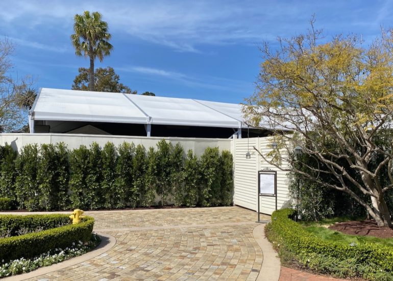
••• Construction is underway at the Rosewood Miramar Beach‘s Bungalow #1, right by the pedestrian entrance to the resort (and as a result, that entrance is closed—you have to walk through the main building to get to the beach).* Bungalow #1 is being converted into four shops. While I was looking up the permits, I found one from November 2023 for “tenant improvement for Zegna,” so that brand is either destined for Bungalow #1 or it’s taking over an existing retail space. And all of this is in addition to the proposed development at the corner of Jameson and Eucalyptus Lane, which could add as many as 12 more shops (for a total of 22 at the resort). According to neighbors, reps for the property have been saying that they hope to lure high-end brands like Louis Vuitton and Chanel. *UPDATE: The path to the beach has been temporarily rerouted, not temporarily closed off.
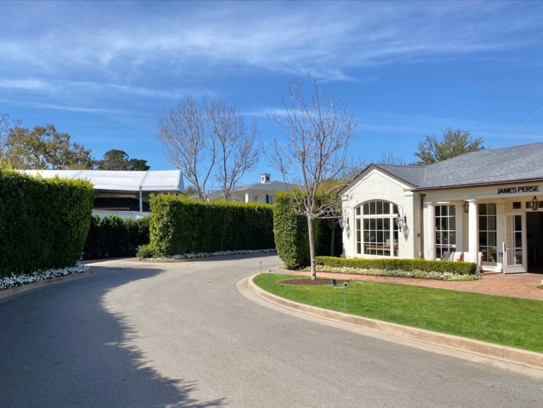 ••• Tahoe-based Venture Apparel Co. has opened at 428 State Street (Gutierrez/Haley).
••• Ziggy Marley plays the Santa Barbara Bowl on July 21.
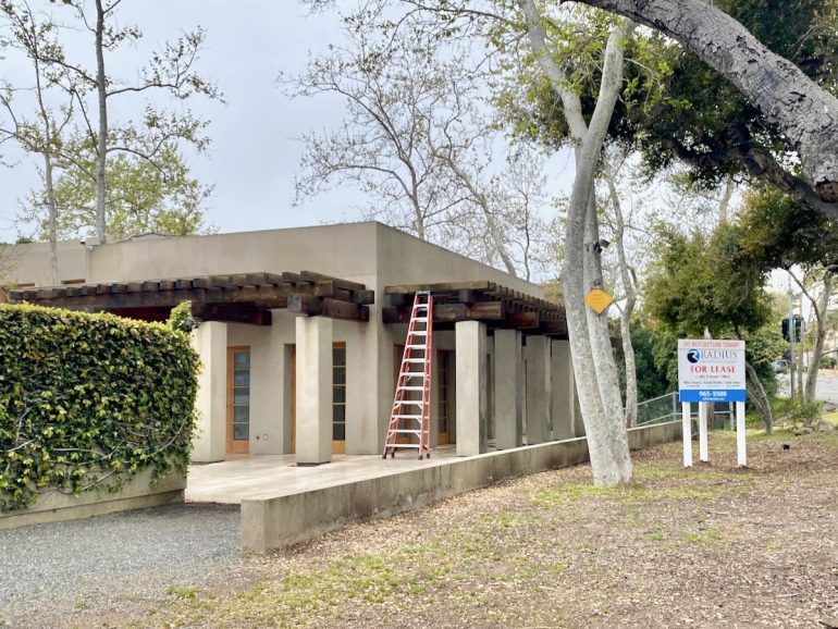
••• The Plant Gallery (formerly Gazebo Gardens) has vacated the building at 1505 East Valley Road. What are the odds it becomes a home design store?
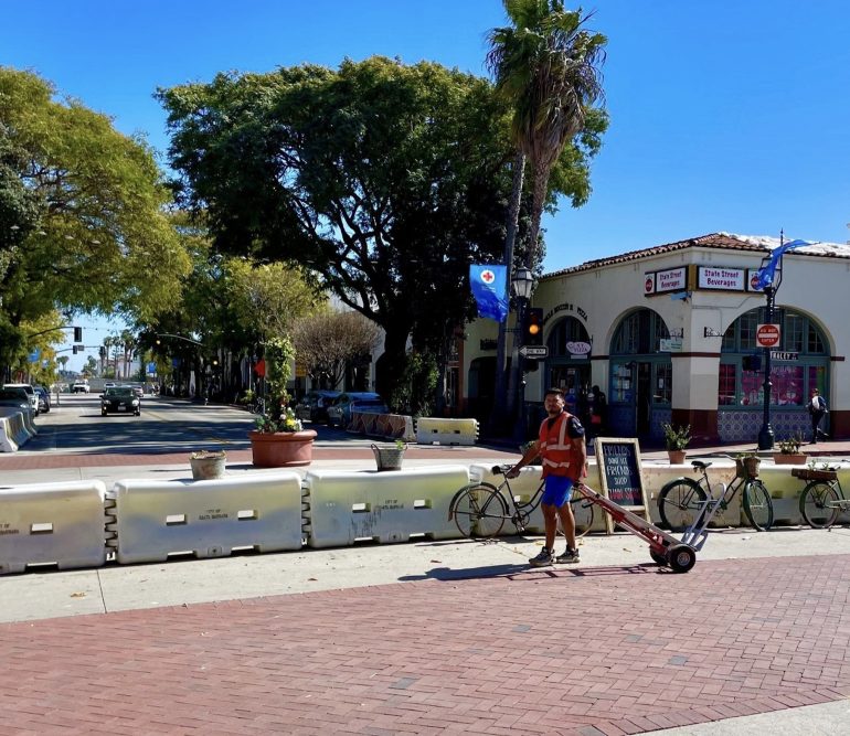
 ••• The city is asking artists to submit proposals to decorate the K-rails (also known as Jersey barriers) at the southern end of the State Street Promenade. As if painting a K-rail makes it look any better….
 ••• The Big Bounce America—”the Taj Mahal of bounce houses,” as described by Thrillist—returns to Elings Park April 26-28. It’s suitable for all ages, but the adult-only slots are for age 16 and up, and if you think I’m getting in that thing with teenagers, you’re nuts.

••• How can you resist an event called Tomatomania? It’s “a two-day free event [April 6-7] for all Tomatomaniacs living in the Santa Ynez Valley and environs who want to produce a bumper crop of tomatoes this season. Browse the many varieties pre-selected by experts for all types of gardens. […] Mark Donofrio, owner of the Starter Farm, home to the Tomatomania test gardens, and his team will help gardeners (veterans and newbies) explore and find the right tomato seedlings for growing success in their region. After years of growing hundreds of varieties, Mark is eager to share his ‘tomato’ lore, knowledge and selections for 2024.”
••• I hadn’t realized that the penthouse at El Jardin, the Jeff Shelton building at 819 Garden Street (Canon Perdido/De La Guerra), is a vacation rental. So is El Zapato a few blocks to the south.
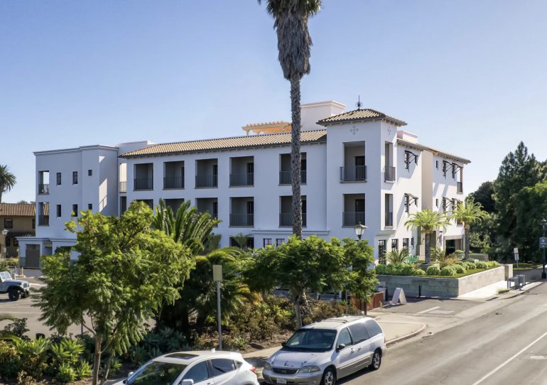
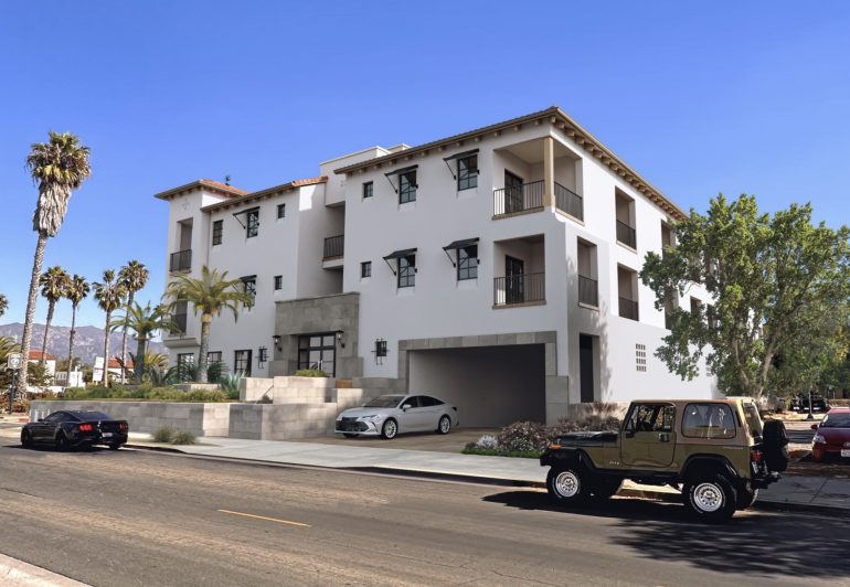
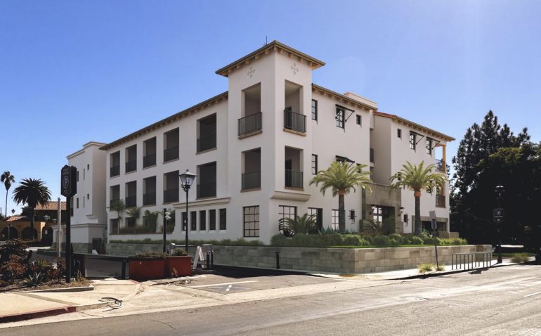
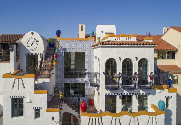 ••• The 44-room hotel in the works at 17-21 W. Montecito Street (where the Ducati dealership is) goes in front of the Historic Landmarks Commission on Wednesday, and now there are renderings.
Sign up for the Siteline email newsletter and you’ll never miss a post.









I thought vacation rentals weren’t allowed. Getting rid of them seems like a quick way to create more much needed housing for renters.
There is an area where short term rentals are allowed, for the most part centered on State Street.
https://www.arcgis.com/apps/instant/basic/index.html?appid=0c3a389f1de645319b10e95a206b32b4
The Jeff Shelton stuff…..I just can’t…..
I’ve studied Art, Design and Architecture my whole life. I don’t get it either…
I don’t understand Jeff Shelton architecture, It looks like a childish cartoon. In my opinion it doesn’t match SB at all especially in main areas like the State street underpass. Don’t like it at all.
Yes, every building should be a bland shade of white with orange tile roofs. As taught in art and architecture schools, all design should conform to the norm, as all good art and architecture looks the same, not like his.
(this is sarcasm).
SBSince I actually agree with you that the idea that the default look for SB buildings should be some vaguely Spanish-Revival-ishhhhh has gone wayyyyyy too far. Especially in the downtown area, the purpose of the HLC seems to have morphed from preserving historic structures, to enforcing an almost theme park level of uniformity. But. I also think Jeff Shelton’s stuff is wack.
And to add – the problem here is not really architects or architecture schools – the issue is the HLC and Design Review Board. They say there’s no dumb questions, but I’d submit that “what would a multi-story municipal garage look like in the Spanish Revival style look like” is actually a very dumb question, and leads to extremely odd disputes like whether or not solar panels on the roof of said structure look like pergolas or not. Or extended fights over the color of bike docking stations. This is how you end up with countless architectural features whose sole purpose is to comply with theme, rather than serve an actual purpose. The El Paseo district above all is littered with fake balconies, cement painted to look like wood and other such oddities that serve one and only one purpose – to adhere to theme in a way that would make Walt Disney proud. The sad truth is that the surest way to develop a property with the current oversight structure is to propose that it’s got stucco walls, some metalwork and a red tile roof. Instead of highlighting the actual historic structures we have – which are on the balance wonderful – these in my mind only cheapen them, offering crappy generic looking versions of the same idea, over and over again. One only has to look to Solvang or the French Quarter of New Orleans (where the current city historian served) to see that the eventual end point of thinking of your downtown as a theme park is the creation of spaces that serve the tourist visitors only, and become spaces that locals want nothing to do with. Unless, of course, you’re Jeff Shelton, then yeah go ahead and make a building shaped like a shoe.
Wow, all this piling-on Jeff Shelton and the SB “look”. I know I won’t convince the critics here, but I love both. The argument for the HLC and preserving the SB Spanish Revival look can be found in almost any other city anyplace in the U.S. There is a new “look” out there that is repeated everywhere – metal siding, concrete, small balconies and bland bland bland. But cheap to build! If you like that sort of thing, Oxnard is there for you. I see new buildings going up in Carp that could as easily be built in Des Moines. Does the HLC go overboard sometimes? Maybe, but I prefer that to no care at all.
As far as Jeff Shelton is concerned, I like the creativity. He pushes the HLC to accept creativity within their restrictions. His buildings make people smile (at least the ones I drag downtown to look at them). You can’t say that about the cement monstrosity I call the Gold’s Gym building on Upper State or some of the other squat gray blocks in other towns.
One vote anyway . . .
Just curious – is it the Marshall’s building that you refer to as the “Gold’s Gym” building?
The ugly “Golds Gym” building is on Upper State across from Seven Points. Sorry, I don’t know its real name. We should have a contest! What’s the ugliest building in Santa Barbara? It would be interesting to see the range of buildings and opinions.
Ha! We should call them the “Worsties.” I went down a bit of a downtown historic rabbit hole this weekend, and found this amazing document with lovely photos and information about State Street as it existed in 1971:
https://issuu.com/santabarbaramuseum/docs/noticias_17_4_winter_1971
The main point that I was making before – that the HLC puts theme above all else – even at the expense of actual historic structures that are not Spanish Revival. Nowhere is this more evident than on page 41, where you can see what 834 State Street used to look like. It was a wonderful piece of architecture, that has since been given a “facelift” that utterly wrecked the original lines, seemingly in the name of theme. That was a BEAUTIFUL building to my eye, and now it’s just part of the Spanish Revival Borg. (Trekkies will get that one.) The same happened catty corner to the building that was Forever 21. If you look on page 37, you’ll see it had simple, modern lines. Maybe not the most exciting thing, but it’s since been redone and themed to the hilt. The same for the Crocker Building that was on the corner of Carillo and State (page 25)- an absolutely LOVELY piece of mid century modern architecture, since given the same treatment. I hope that the same fate doesn’t await the Marshall’s building – It needs a little sprucing up, but I love the dramatic eaves and columns. All of this asks the question – what is historic preservation? Is it preserving historic structures, as wonderful time capsules of the time in which they were made, or is it forcing all building over time to conform to one single architectural style?
I agree. Love Shelton’s creativity and the combination of whimsy and classic Spanish style. When I first saw his work I immediately thought of the famous Spanish architect, Antoni Gaudi, who helped make Barcelona such an unique place. I think Jeff and his vision has enhanced Santa Barbara and contributed to our status as a beautiful city filled with remarkable architecture.
Another vote for Shelton. In general I like a lot about Santa Barbara buildings, red tile roofs, beautiful Spanish architecture, the white stucco, etc. And I also like Shelton’s whimsical and very creative look.
On the Gaudi reference – I was in Barcelona in November for the first time. Knew of Gaudi. Other than La Sagrada Familia I didn’t know any of his other buildings. While walking my first night there headed to see the church at night I ended up seeing 2 of his buildings. They stood out in the most magical way in a city full of beautiful buildings. Decades after they were built the Gaudi buildings still stand out.
Santa Barbara is full of creative, artistic people and when I see a Shelton building I think of all the artisans who did the iron work, tile, etc. A little Gaudi. A little Dr. Suess. I just think his work is fun and it’s nice to stumble upon one.
My 2 cents.