A group of investors led by developer Neil Dipaola has filed for a concept-review meeting with staff from various city departments—formally known as a Pre-Application Review Team—for the massive redevelopment of the full 2.1-acre block bordered by Yanonali Street, Santa Barbara Street, Mason Street, and Gray Avenue. The working name is SOMOfunk (as in south of Montecito Street), but that’s not expected to get used on the finished product.
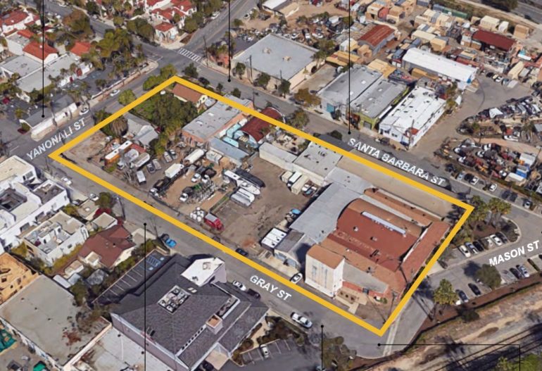 Nearly all of the existing structures will be torn down to make way for “a cluster of unique buildings and identities that maintain the scale and character of the neighborhood.” The plan calls for 144 rental apartments (many of which are small, and 27 of which are for low-income tenants); 12 top-floor condominiums (two of which are for moderate-income buyers); and ground-floor commercial spaces for restaurant, retail, art studios, and light industrial use. As you can see below, the parking garages are placed in the interior, so as not to overwhelm the streetscape.
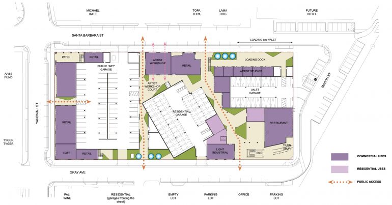
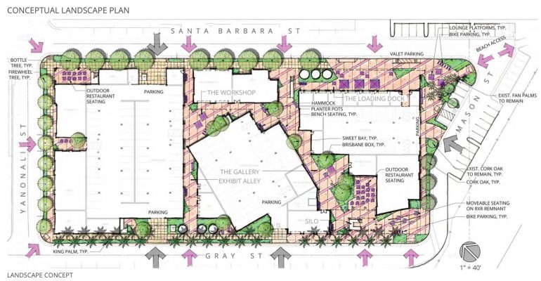 The Cearnal Collective architecture firm, landscape designer CJM::LA, and civil engineer RRM Design Group have come up with a “porous” design that aims to give the area what it needs without sacrificing what makes it distinctive.
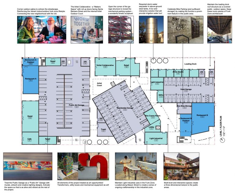
The project block has been intersected with public alleys (paseos) and public courts that engage the neighborhood and bring the interior of the block out into the public sphere. The perimeter of the project and these interior connections are lined with either commercial uses or residential uses to activate and enliven the streetscape and the interior-scape. Some of the commercial spaces are designed to further create a permeable edge to the project, the Artist Workshop space is designed with roll-up doors both facing Santa Barbara Street and the interior Artist Workshop Court. […] The commercial spaces focus more on Yanonali Street and Santa Barbara Street where the Funk Zone currently has an active streetscape.
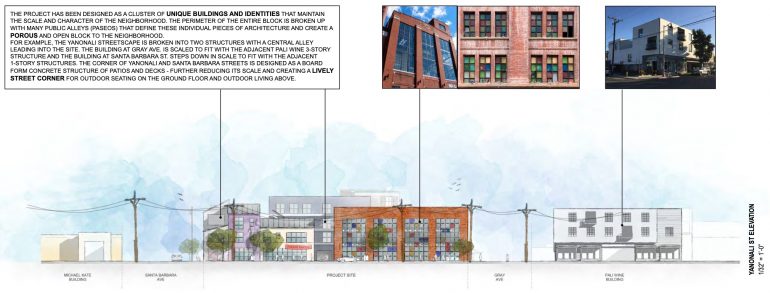
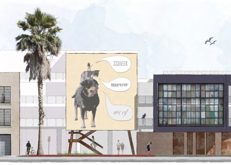
The elevations give the best sense of how the project will be composed of a mix of architectural styles, as if the block had grown up that way over time. Click on an image to see it larger and read the text, which elaborates on many of the design decisions. For example, on Gray Avenue, there will be street-level tanks to collect rain water, an homage to factory architecture.
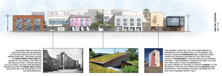
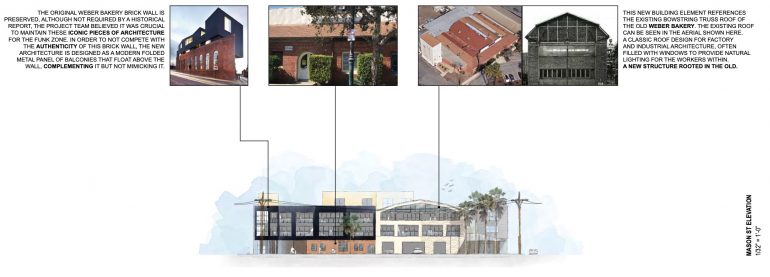
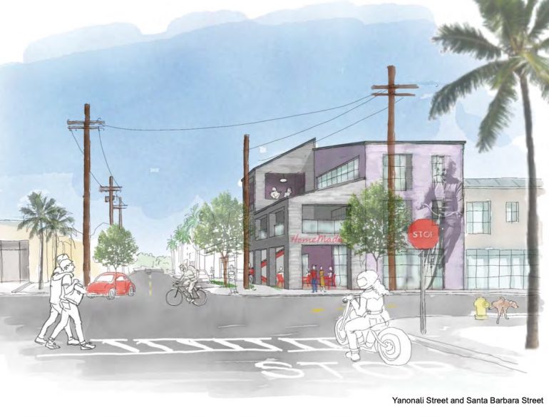
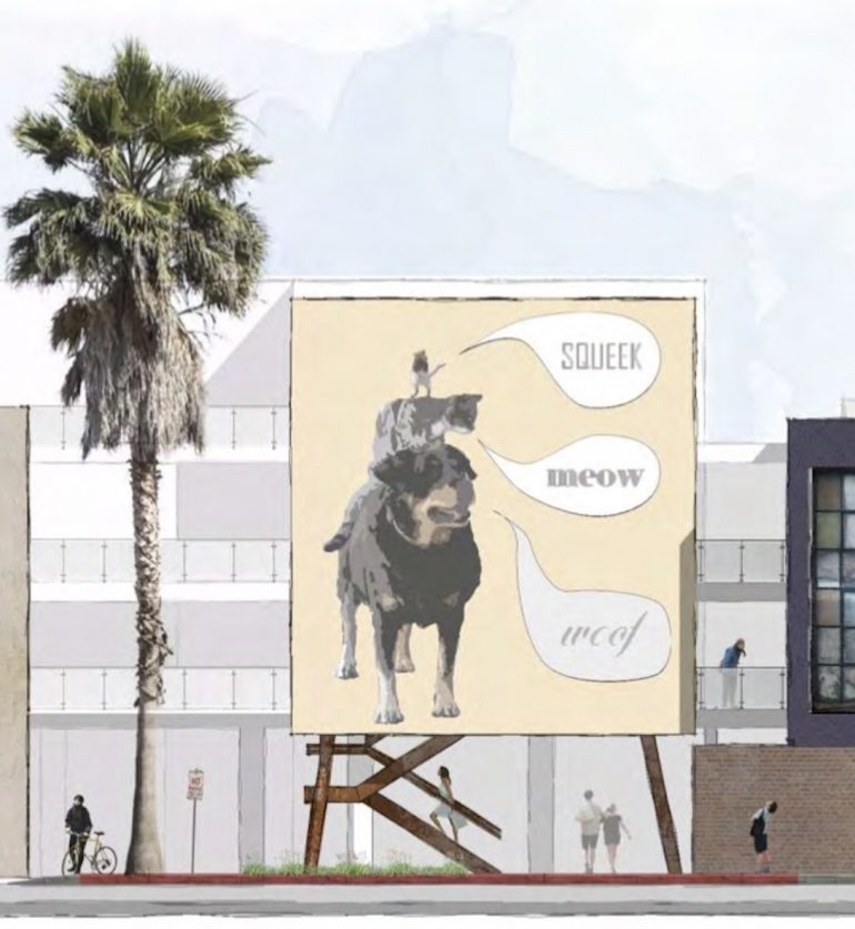
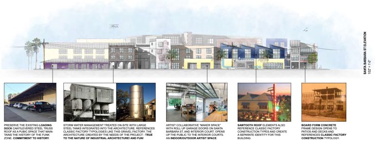 The sketches offer further color. The murals are presumably placeholders.
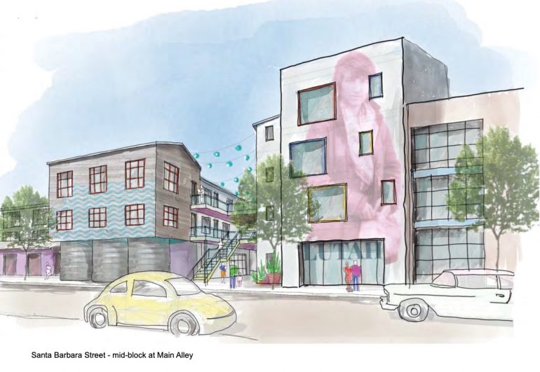
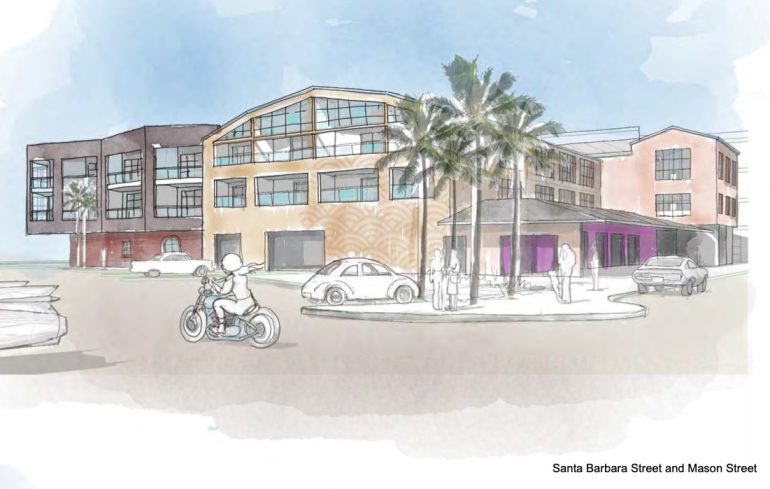
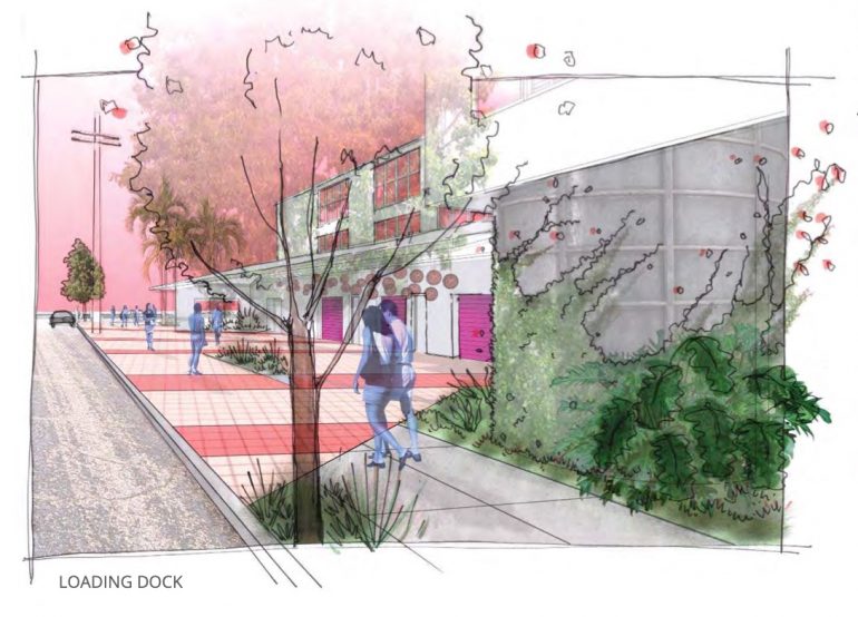
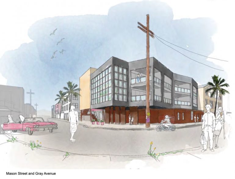
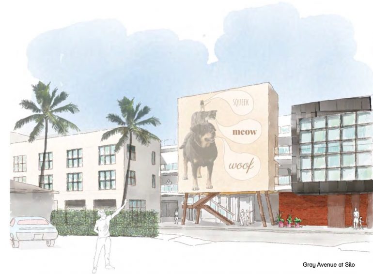
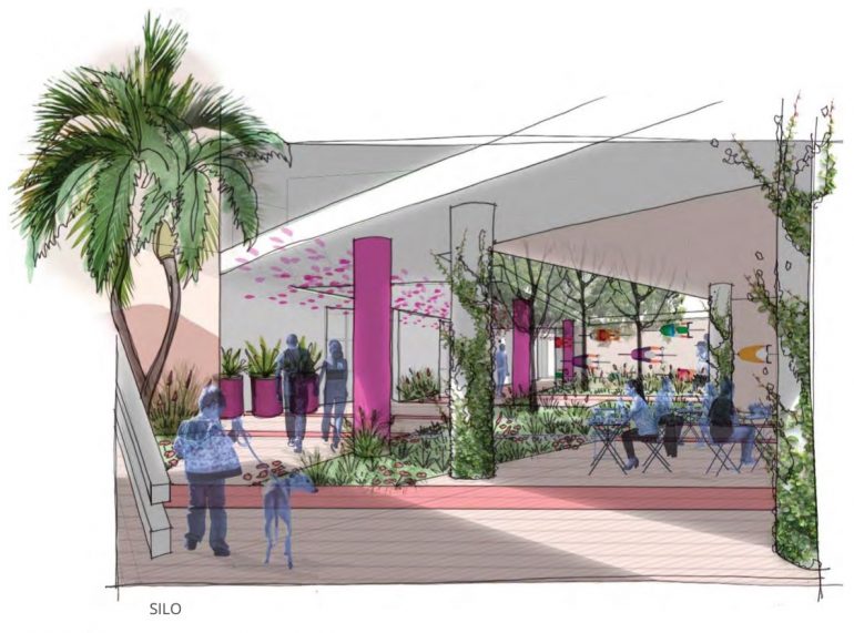
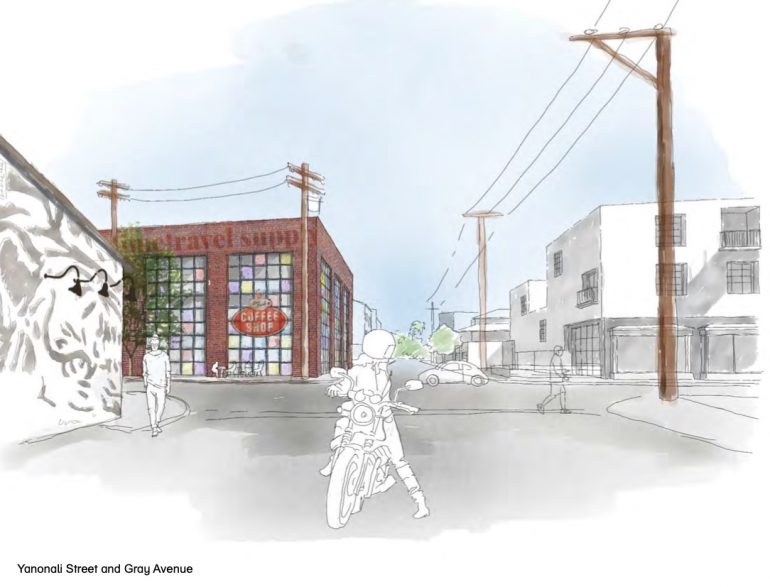 Much is made of the four features getting preserved (or in the case of the Loading Dock, recreated in a new building):
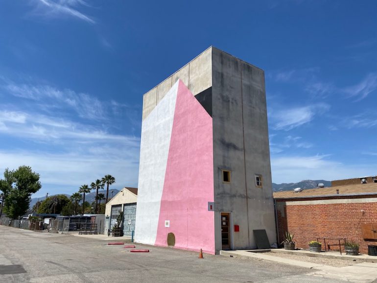
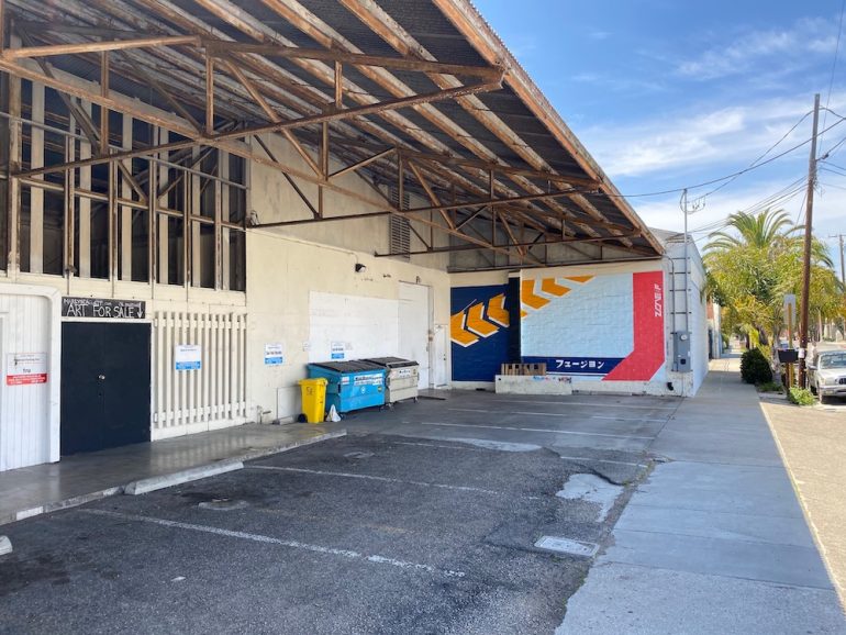
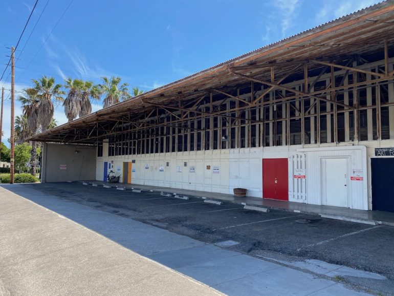
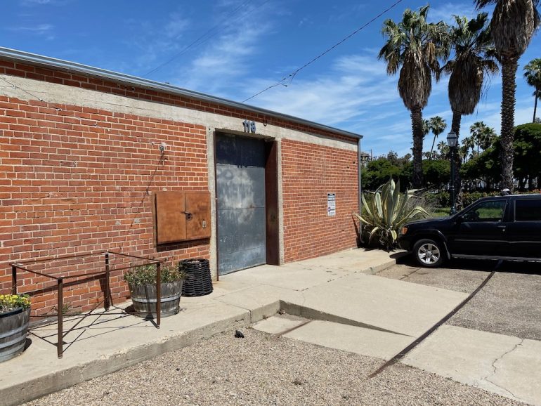
The project site also preserves many of the iconic architectural elements of the Funk Zone, including the Silo, The Loading Dock, The Weber Bakery brick wall, and The Train Spur. The Loading Dock is proposed to function as an outdoor space during the day and as the actual site loading dock during the early morning delivery time. The Loading Dock is lined with artist studios with roll-up garage doors [….] Features such as the original train tracks of the train spur that served the Weber Bakery is preserved and the original Weber Bakery silo is repurposed as a staircase.
The Silo at 118 Gray will be open at the base, as was the case originally, allowing train cars to pull in underneath. In the second image below, note how the upper-floor apartment complex is ghosted out. This is a technique to minimize massing; real life will not be so accommodating. A scale model would give a better sense of the overall effect.
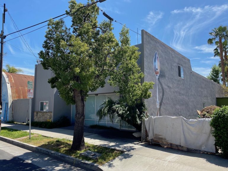
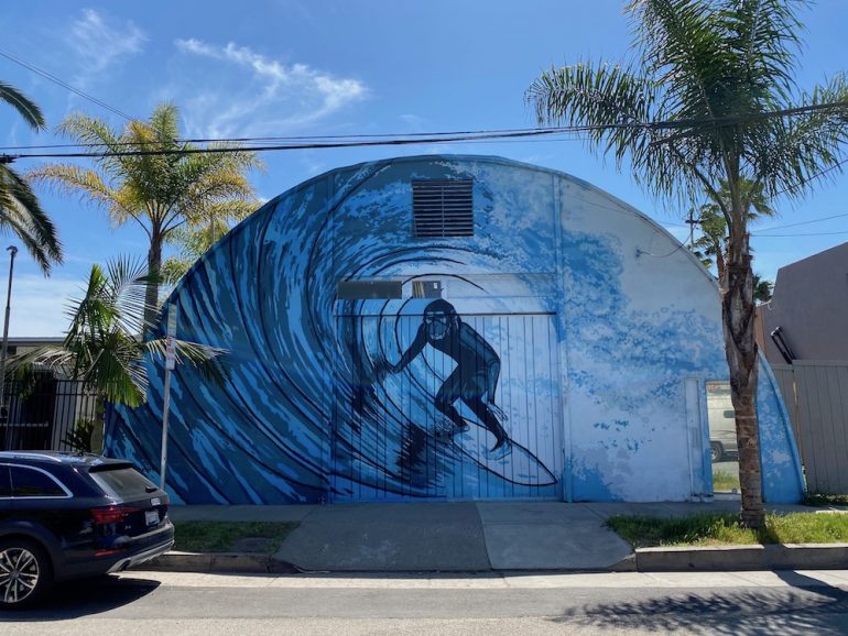
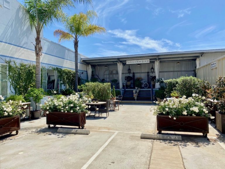
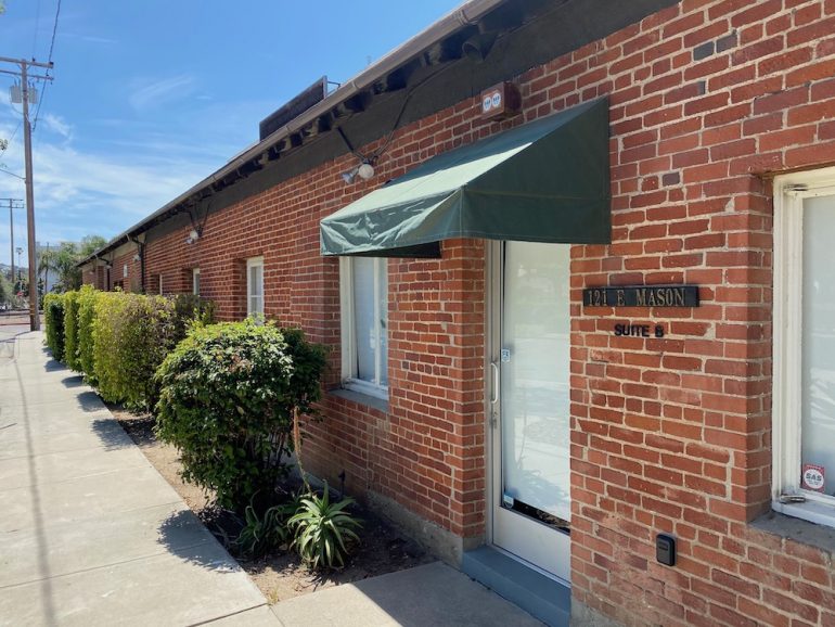
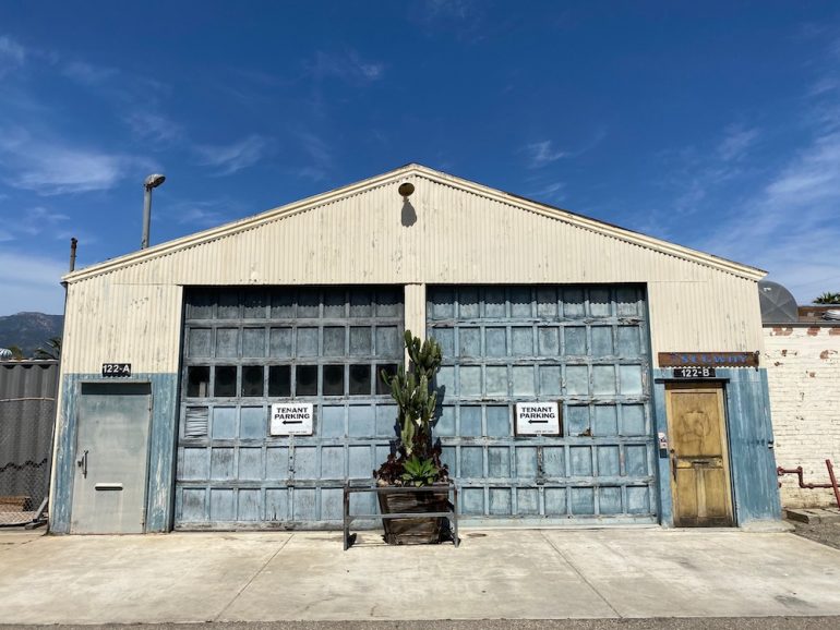
 To achieve all of this, many buildings have to be demolished.
 The total floor area—i.e., over all four floors—will be 193,941 square feet. The 91,497 square footage mentioned below is the lot area. The proposal more than doubles the current ground-floor area of buildings, while reducing hardscape (much of which is now truck and bus parking) and landscape. It’s a big step up from the last plan floated out, which called for just 64 apartments and around 50,000 square feet of commercial space.

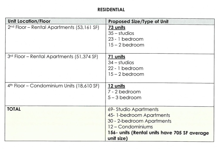
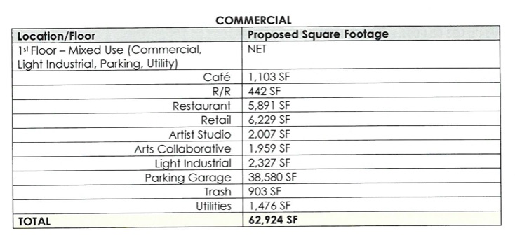 Click on the floor plans to see them larger. Interestingly, the developers want local residents and employees to have first crack at the rental apartments, and the City Housing Authority has offered to oversee the process.
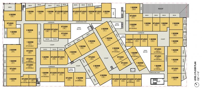
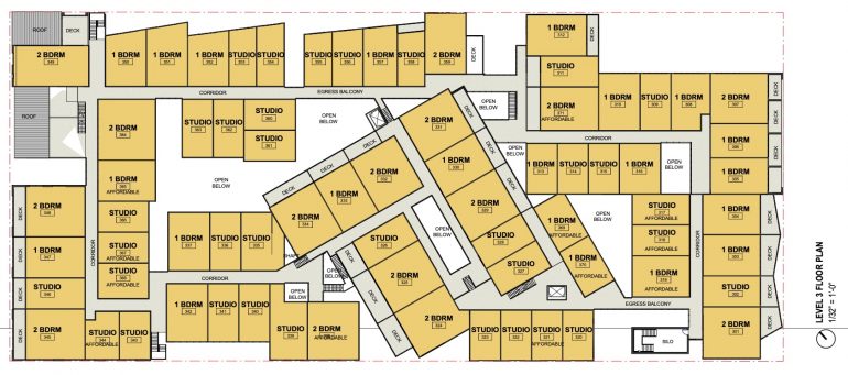
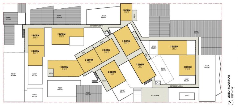
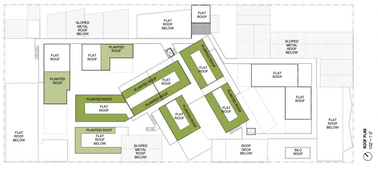 The proposal gets into technical details about the request for additional density, including alternatives for changing the mix of low-income and moderate-income apartments. (Neither alternative would affect the design and physical features.) I’m not qualified to weigh in on any of that; if you’re interested, email [email protected] and I’ll forward you the proposal. As a taste, here are the questions the developer submitted to the Planning Commission for this round.
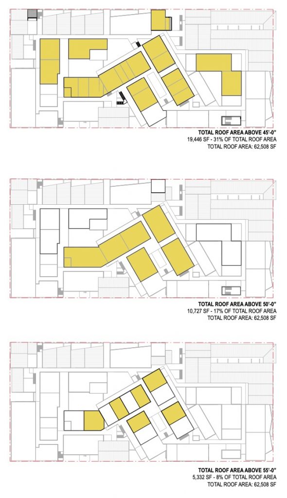
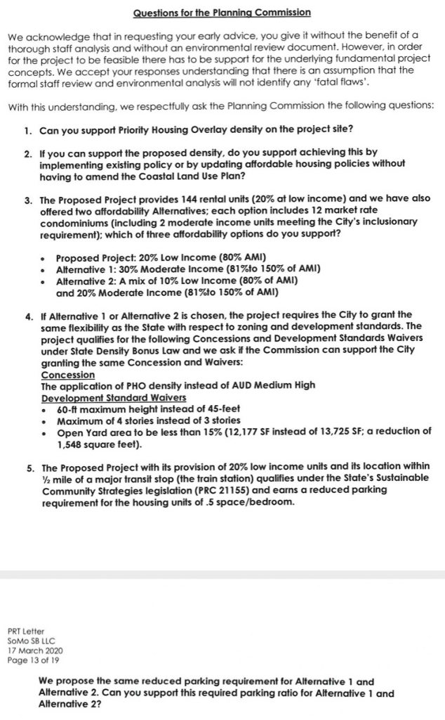 The developer is also requesting variances to allow buildings as tall as 60 feet (versus the legal 45 feet) and four stories (instead of three). The main argument is that if the city wants more residential housing as badly as it says it does, then it has to loosen some of its restrictions. The developer notes that (a) the four-story buildings are almost entirely away from the perimeter and not visible from the street; (b) “most of the structure that exceeds the 45-foot height limit only does so by a few feet, remaining under 50 feet,” in order to create “more livable ceiling heights of 9 to 10 feet” and space for more efficient parking systems; and (c) “only 17% of total roof area exceeds 50 feet high and only 8% exceeds 55 feet high.”
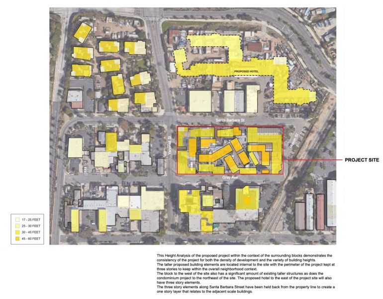
 That said, the graphic below shows how much denser this block will be compared to its neighbors. And the “proposed hotel” between Santa Barbara Street and Garden Street is news to me. Can anyone tell me more about it?
 It’s unfair to expect a new development to have the patina—the funk, if you will—that only time can bestow. Certainly, the mix of architecture is a step in the right direction. The landscape will also nod to the area’s past, with “remnants [to] be repurposed for use as hardscape, furnishing, and sculptural elements throughout the project site.” The rail track, for instance, will have movable seating, as on the High Line in New York City.
 In an attempt to honor the Funk Zone’s artistic heritage, transformers, utility boxes, and mechanical equipment will be “treated as art opportunities.” Same with the parking garages: “The public garage is proposed as a Public Art Garage that draws people in (and through) with artwork, murals, and creative lighting. A corner of the residential garage will be open to the public alley with the mechanical lift painted bright colors, creating a dynamic kinetic sculpture when in use.” The residential garage will have 101 spaces, while there will be 56 spaces in the Public Art Garage and 54 in the valet-only garage. There are also plans for 144 bike parking spaces for residents.
And that brings us to the end. The next step isn’t clear: “We are currently conducting our initial staff review,” said a rep at the City Planning Commission. “At this point, combined with the Covid-19 situation, it is difficult to forecast what permit path and/or what hearing dates will be forthcoming.” I’ll try to keep everyone in the loop.
·················
Subscribe to Siteline’s email newsletter and you’ll never miss a post. You can always unsubscribe.










The aesthetics are all wrong. I’m a mid 30s pro-development native (who left for NYC + London for 15 years – happy to be back). I’d like to see a lot more high-density housing built downtown, and the funk zone continue to grow and be developed. But everything from the name to the cheesy murals and the POMO building toppers is out of step with anything that feels “Santa Barbara.” This looks like something proposed to reinvigorate the downtown core of some failed rust belt city in 2011. I also fundamentally disagree with the proposal to raze an entire square block given that at least a few of the existing structures could be preserved to add the texture the developer is going for with the variation in size/etc. between buildings, while maintaining essential character and some history. This is the rare instance in which I hope all of the architectural committees, etc. are as tough as can be and do not let this pass in its current form.
FOUR STORIES?? Low income at the waterfront? This is just to get approval for the density. Pearl Chase is rolling in her grave. This is so far out of conformance with this areas usage intent. I have been involved with living and working in the Funk Zone since the 1970s. I am a home owner/artist in this neighborhood since 1997. I have been to the council meetings back in then when zoning and building code changes were discussed and approved with conditions. The original intent of even allowing a third story in this zoning was to break up a flat roof line that would occur with a 2 story limit. They said that “minimal third story architectural design elements would be allowed only for the purpose of adding aesthetic interest and breaking up of the flat 2 story look”. This is clearly a ‘give an inch they’ll take a mile’ situation. This project is beyond over reach on that original intent. The developer is grabbing for a 4 story monstrosity of concrete cubicles to cram an insane amount of people and business square footage into. My concerns, to name a few, are skyline obstruction, public right- of-way encroachment, inappropriate area for high density, insufficient parking ( about 90 spaces short) , poor egress access, where’s the open space? Landscaping is virtually non existent traffic congestion backing up at Garden with only one way in from 101 . The residential parking layout is unrealistic. I can’t imagine where a double parking situation would ever work in reality. The artist studios?? Seriously? This is just a maximize return on investment project. More gentrification pretending to be conceptually compatible, the rental rates here are now well $5.00 sq ft + triple net, if built, no way artists can afford to be in this space . Don’t be fooled by the art studio labels that’s just a tactic. It’ll be filled with more of the same. Please scale this back!
Looks just like Ventura’s revamp. Why do we want to copy Ventura? If developers take state funds for housing then SB locals will not income qualify and we’ll be mandated to import low income residents. Exactly what happened in Truckee. Beware of false promises folks.