The plans have dropped for a big, interesting project in the Funk Zone, to be discussed by the city’s Planning Commission on October 14. The address is 35 Anacapa Street, currently a vacant lot; an entity called 35 Anacapa LLC—which appears to be the Theimer Group—brought the property from the Museum of Contemporary Art Santa Barbara for $2.9 million in June 2020.
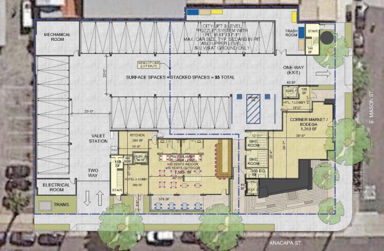
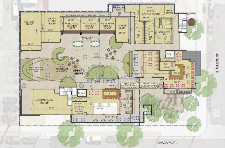
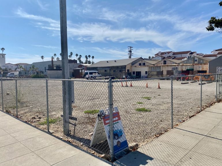 From the Planning Commission’s agenda: “The project consists of a new three-story development on a 0.5-acre vacant lot located at the southwest corner of Anacapa Street and E. Mason Street. The proposal includes two options (airspace condominium map or lot split/lot-tie agreement) for development of one building consisting of two small hotels, corner market/bodega, various types of restaurants (sit down, coffee shop, and fast casual kitchens), a tasting room, artist studios, an art gallery, and other retail space.”
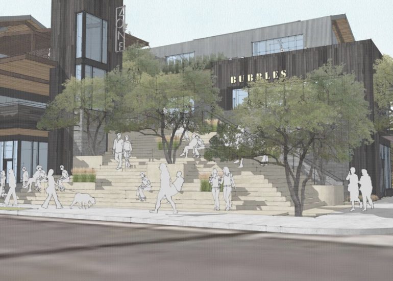
Without further ado, let’s get to the renderings. (The design is by the Santa Barbara/L.A. firm DesignARC.) From Anacapa, looking west:
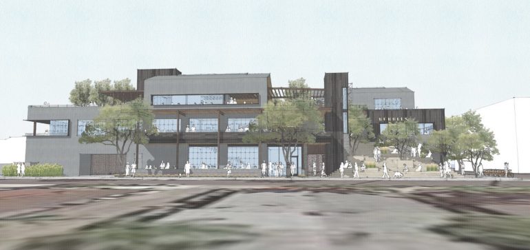
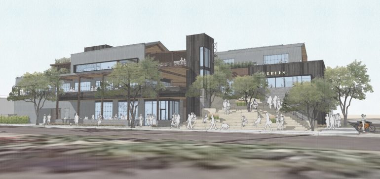 From Anacapa and Mason, looking southwest and south:
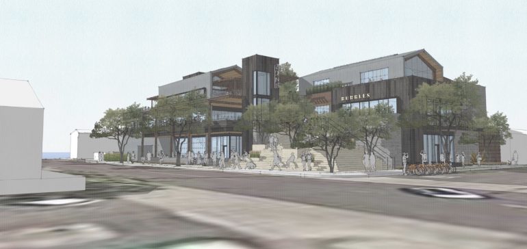
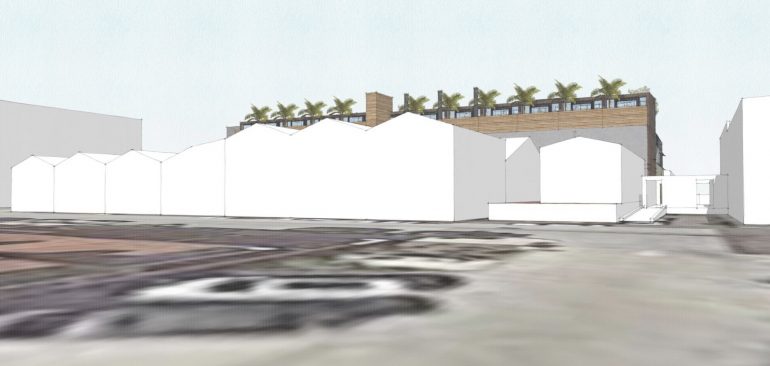
 From Anacapa, looking northwest:
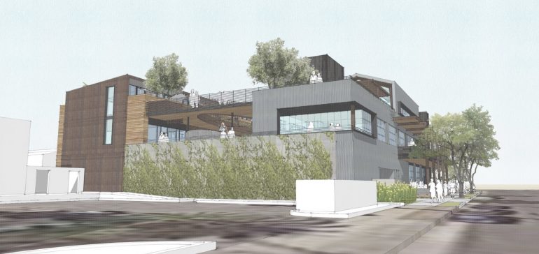 From Mason, looking southeast:
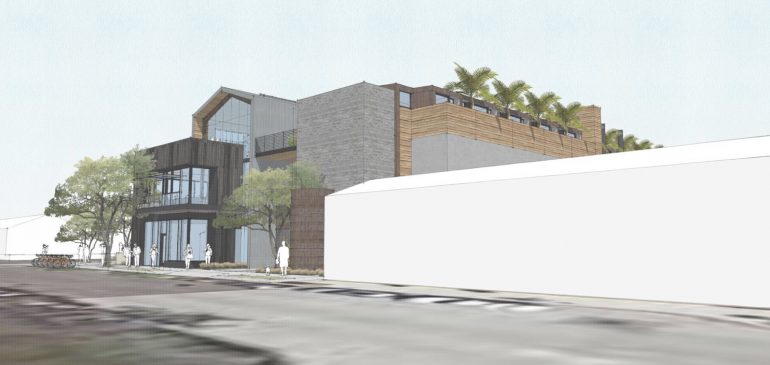 From Helena Avenue, looking east:
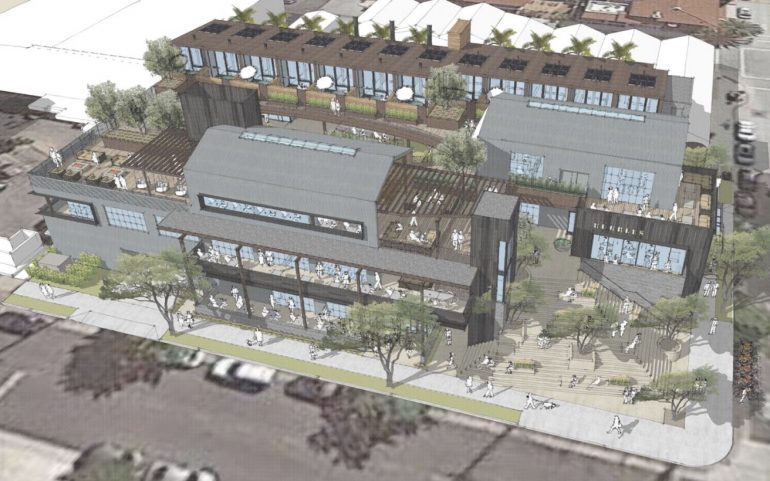 I’m sure there are already readers getting ready to comment about how this will be the nail in the coffin for the Funk Zone. Personally, I think this could be one of those embrace-the-future moments that so often bedevil Santa Barbara. Is all change bad? The past isn’t coming back; the Funk Zone will never be funky the way it once was. To its credit, this design is far from run-of-the-mill architecture, what with the chockablock roofline, massive courtyard, myriad decks, second-floor commercial use, and the roof cut-out, and I couldn’t be more delighted to see something besides more Spanish Colonial Revival architecture. If any part of the city can handle contemporary design, it’s the Funk Zone.
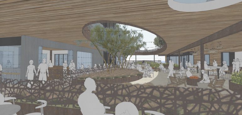
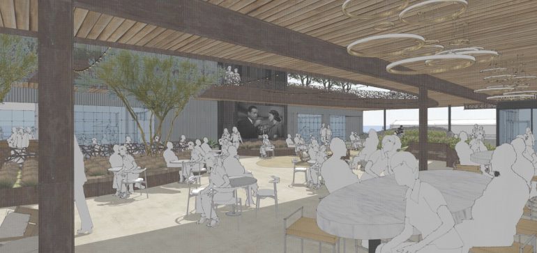
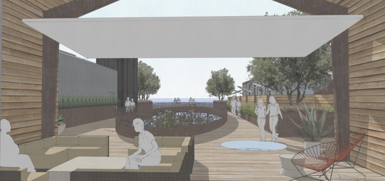
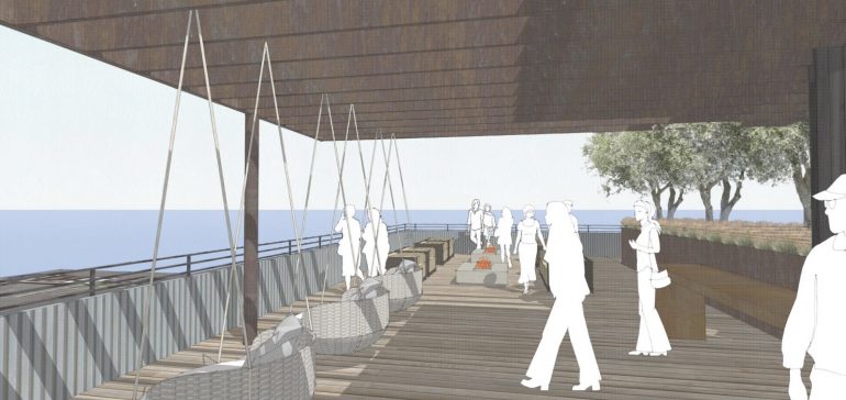
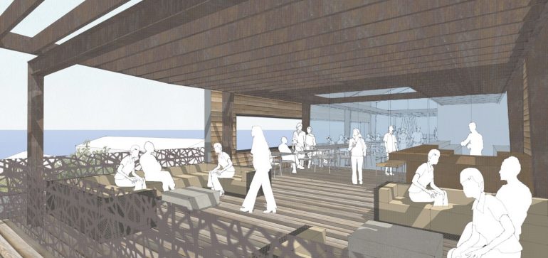
The plans also include looks at a few spaces. These three are all labeled “courtyard”—and seeing as how renderings rarely mention real businesses unless they mean it, the smart money is on Third Window Brewing moving in someday. (You could hardly blame Third Window for wanting to be somewhere with more action.)
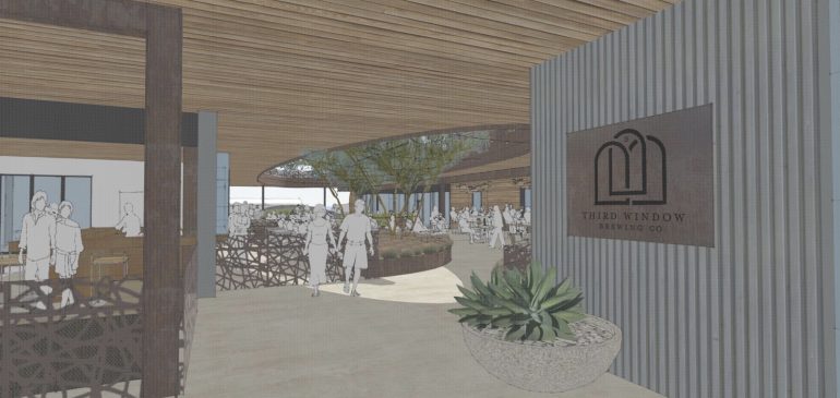
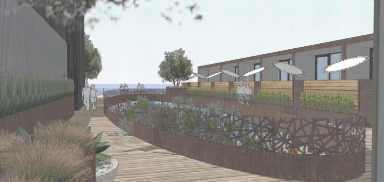
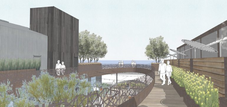
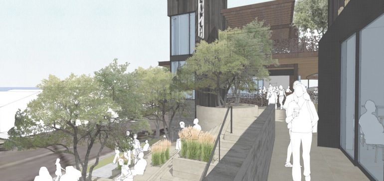
 These two are of the “hotel courtyard”—the modular-looking section to the right is where the rooms are.
 The indoor-outdoor hotel lobby:
 The bar (looking south and north), a real hubba-hubba moment:
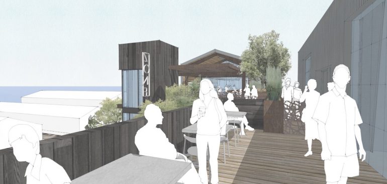
 The “hotel amenity space,” whatever that means:
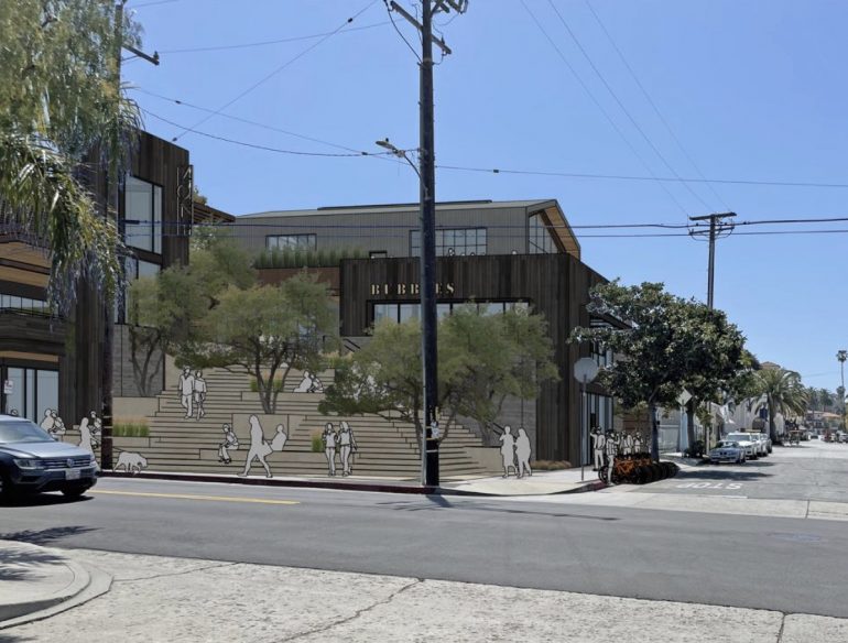
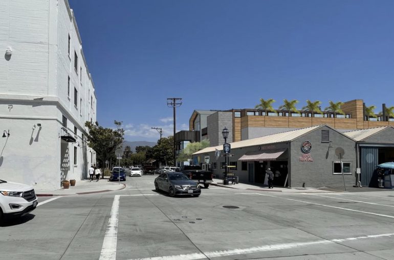
 And here are some renderings inserted into actual street scenes.
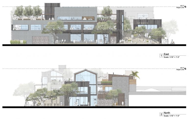
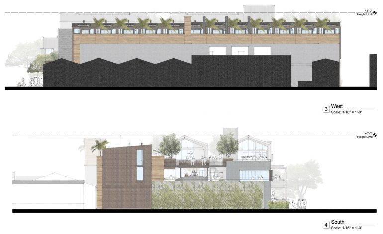
 I’m not sure the elevations add much…
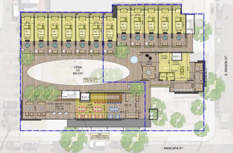
 …but the floor plans are fascinating. You’ll recall that the agenda description mentions two options. Here’s option one’s first, second, and third floors, respectively. (Click on them to see them larger.)


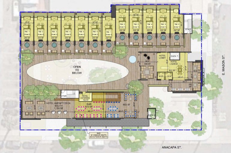 And here’s option 2, which splits the property into two lots, with two hotel lobbies on the ground floor (but with the same 12 guest rooms on the third floor, so the reasoning is unclear):
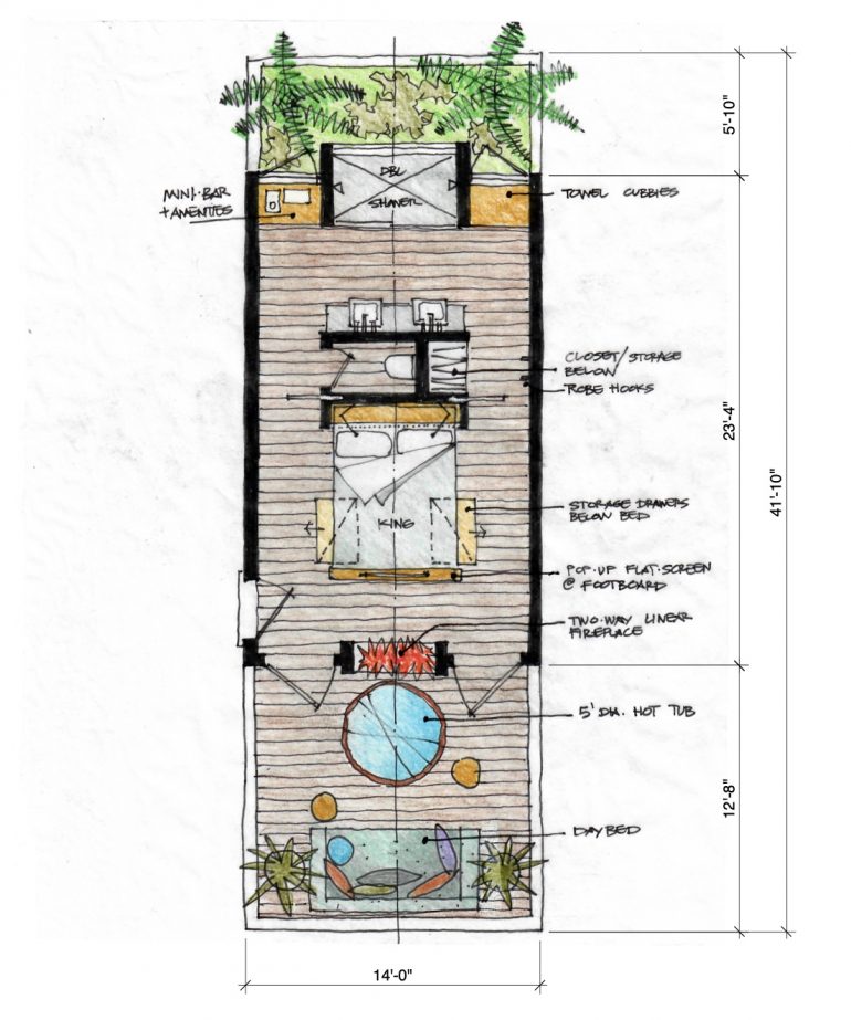
 A hotel room. Note the shower facing a mini garden and the hot tub in an enclosed area abutting the courtyard.
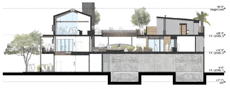
 A cross-section of the building:
 And that’s it. If this and the full-block SOMOfunk development nearby come to fruition, the Funk Zone will certainly be a different place a decade from now.
················
Sign up for the Siteline email newsletter and you’ll never miss a post.









Thanks for this refreshing take on change. To put it in other words – Change is inevitable. We just need to affect it to get the desired outcome. And this change should work for literally everyone except for the Karens of the world.
Thanks to Arvand for labeling anyone with any feedback a Karen.
Inspiring project with a great feel, especially the staircase. Way too many finishes though. Looks bad now, will look even worse in 20 years. Less corten steel and wood cladding, and more of the corrugated metal and cement finishes they’ve also included would be good and in keeping with the area. Corten steel is beautiful, but isn’t relevant to our area. The connectedness to the outdoor areas is particularly compelling.
I work in the FZ every day and this looks great to me. Now I just wish the guy that’s going to level the cute green cottage across from Tyger, Tyger would reconsider his behemoth, gawd-awful project. Save the heart of the FZ.
this is so much cooler than the ground level mini-golf i was envisioning
Honestly, it would be a nice welcome change — and keeps people/tourists/LA in a central spot. The architecture looks beach appropriate — albeit a very southern california 202x-predictable take on that. And yes, all those finishes won’t age too well in the constant salty marine air… but in a way, that will quickly make it funky again in ten years. So by 2032, this will be full of funky aged culture. And in that regard, I’m kinda all for it!
Looks interesting. My only question is “where are we going to get the water to support it?” Drought is here to stay and only going to get worse.
It’s right near the desal plant, right? /s
I’m with you. SB has plenty of hotels. We need more housing for locals who are aware of our water emergency.
I guess I am a male Karen but I am a fan of the Spanish Colonial look. This belongs in Ventura or Oxnard. It will not age well.
You mean spanish colonizer?